Redesigning SoFi’s landing page to emphasize core services and elevate brand perception.
My Role
AIDA Research
Market Research
UX/UI Design
Prototype
Team
Personal Project
Tools
Figjam & Figma
Chat GPT 5
Duration
May 2025
(1 month)
Overview
AS-IS
Problem
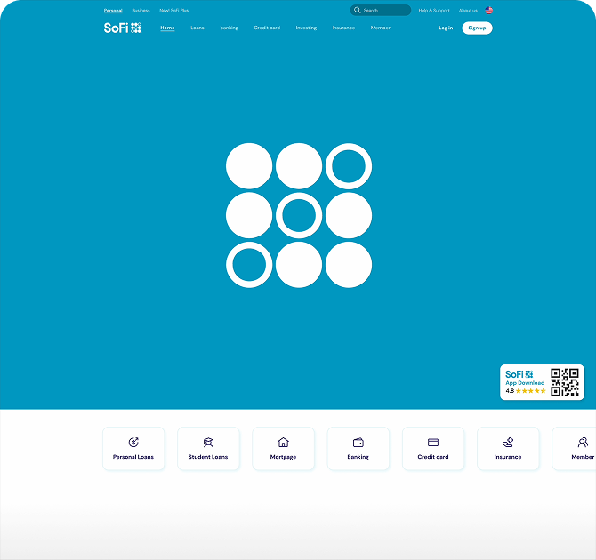
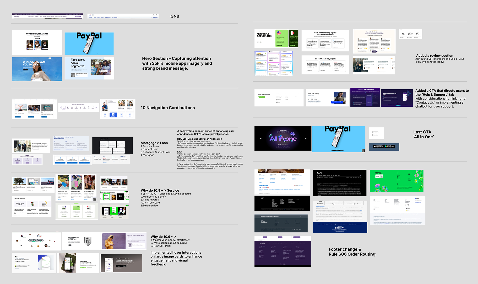
Hero & Contents section
A static hero section that fails to capture attention
An overly complex menu structure caused by excessive color use
Lower section & Footer
A low-placed app download CTA and low-quality visuals.
an infinite-scroll footer that overemphasizes financial regulations
How might we improve trust and drive action on SoFi’s homepage using the AIDA framework?
* AIDA : Attention → Interest → Desire → Action
TO-BE
Solution
Hero & Contents section
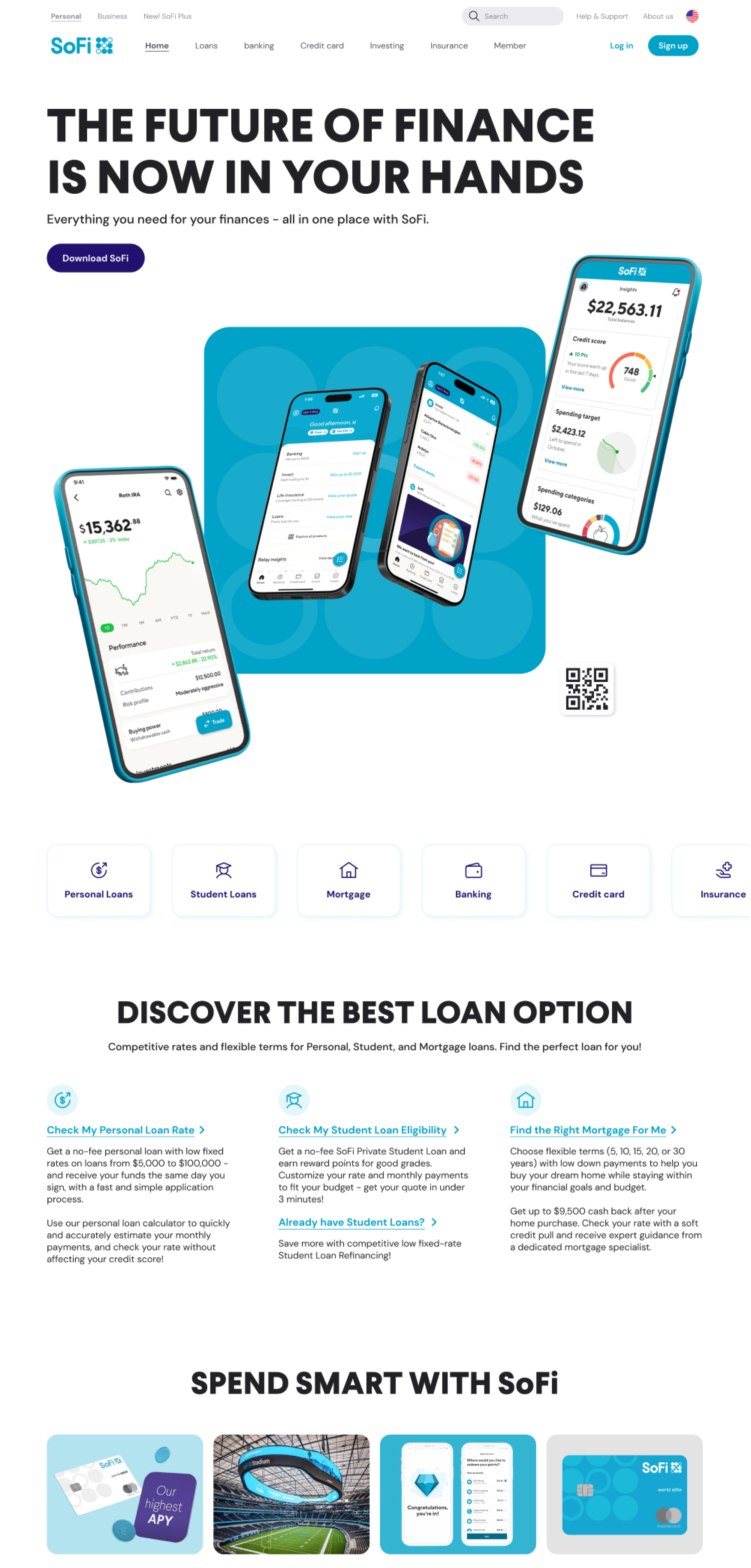
App-Focused Hero & Clear Navigation
We highlighted the app with an interactive hero section and reorganized global navigation bar (GNB) menu categories for clearer navigation.
Lower section & Footer
Enhancing Trust Through Visual Interaction
We highlighted key services with visually engaging hover interactions, introduced reviews, and cleaned up the infinite-scroll footer into a dropdown.
Design Process
Discover
What SoFi Should Communicate in the Fintech Landscape?
Secondary Research
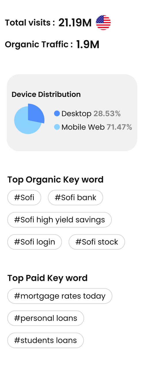
Analysis of Improvement Opportunities and Priority Services on SoFi’s Landing Page
To clarify brand trust and service priorities on SoFi’s landing page, we analyzed competitors, reviews, and traffic & keyword data. We found that trust and priority services were not clearly communicated, highlighting the need to drive stronger app adoption for savings, investments, and loans.
.png)
%20(2025-05-08).jpg.jpg)
Key Insights from Secondary Research
Unclear priority services on the landing page
Core services lack clear hierarchy, making it unclear which offerings represent SoFi’s strongest value at first glance.
Weak trust signals on the landing page
Messaging around SoFi’s all-in-one platform is weak, preventing it's marketing and branding from effectively building trust.
IDEATE
Exploring Design Directions for SoFi’s Landing Page
Competitor analysis & Collage
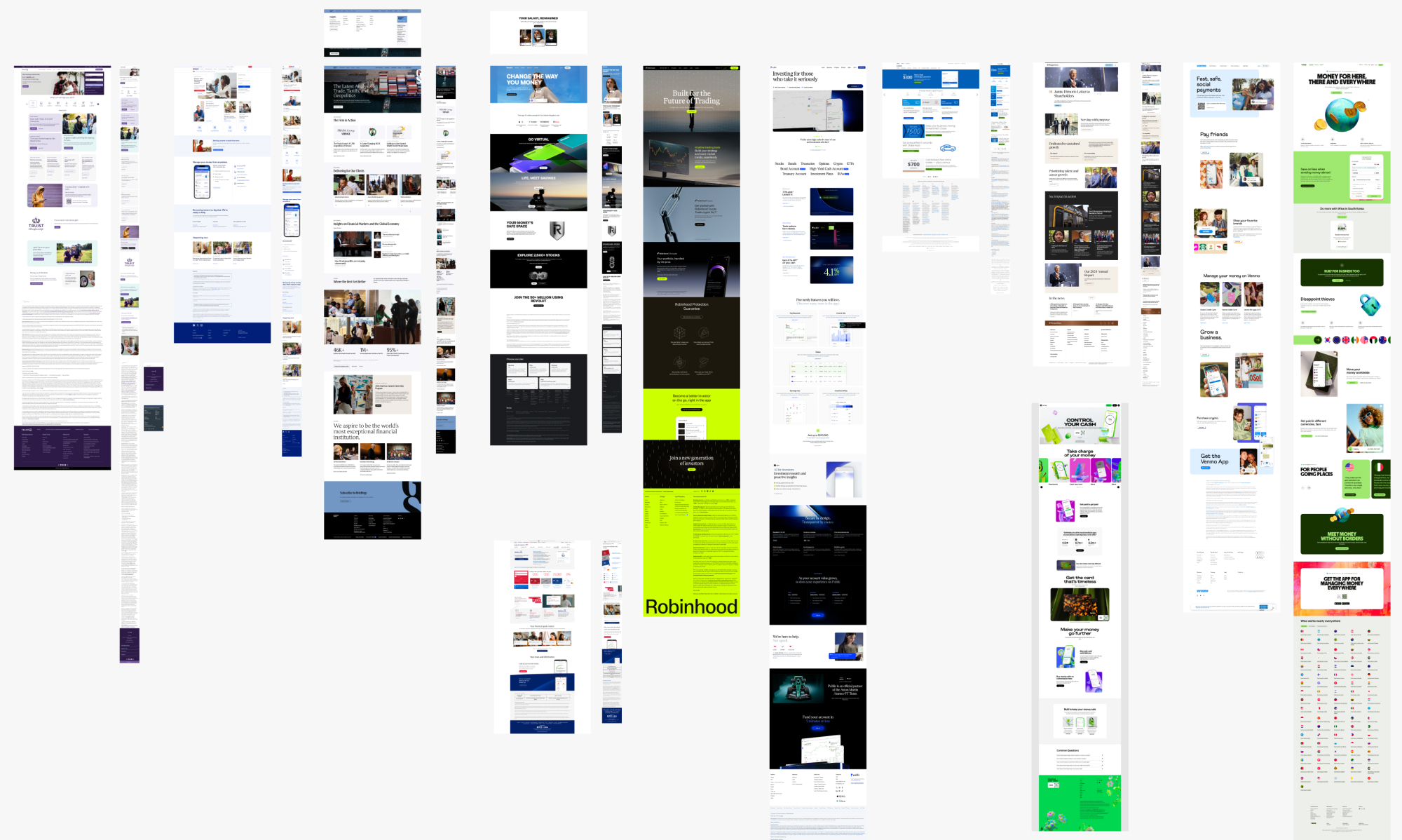
Ideating Layout and Interaction Possibilities Through Competitive References
To establish a redesign direction, I analyzed leading fintech and banking websites and created a reference collage. As a result, I identified card-based layouts, column structures, and interaction patterns suited to SoFi, defining a design direction to improve usability and engagement.
Problem statement · HMW
Reframing the Problem into a Design Question
On SoFi's homepage, unclear service structure and weak communication of its core value leave users uncertain and less likely to take action.
How might we improve trust and drive action on SoFi’s homepage using the AIDA framework?
* AIDA : A marketing model that moves users through Attention → Interest → Desire → Action.
Solution
Building Scalable Digital Experiences
Design System
Refining the Design System to Strengthen SoFi’s Brand
To align with SoFi’s brand identity, I retained key brand colors and typography while systemizing interactive components, resulting in a more cohesive and consistent website experience.
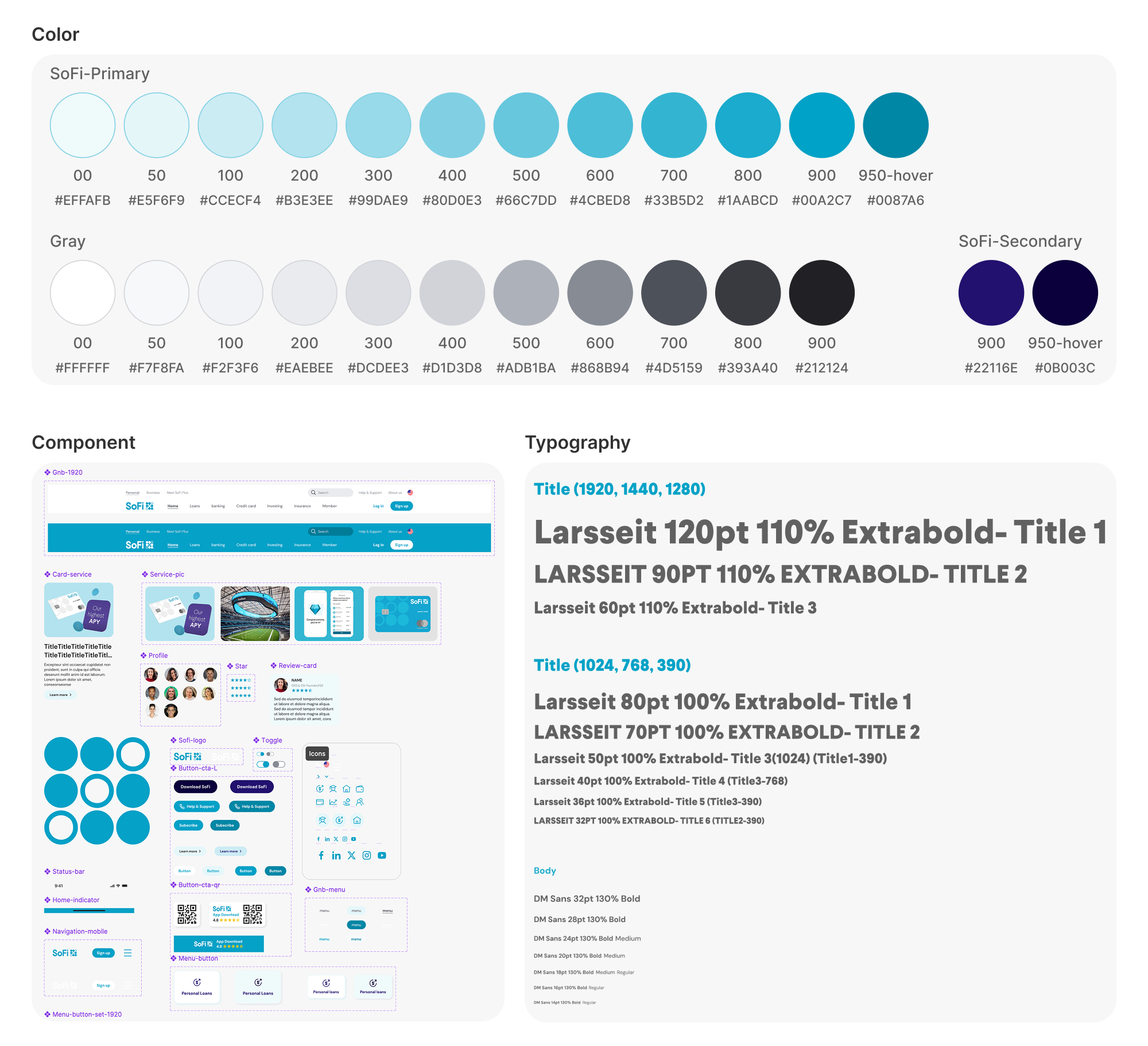
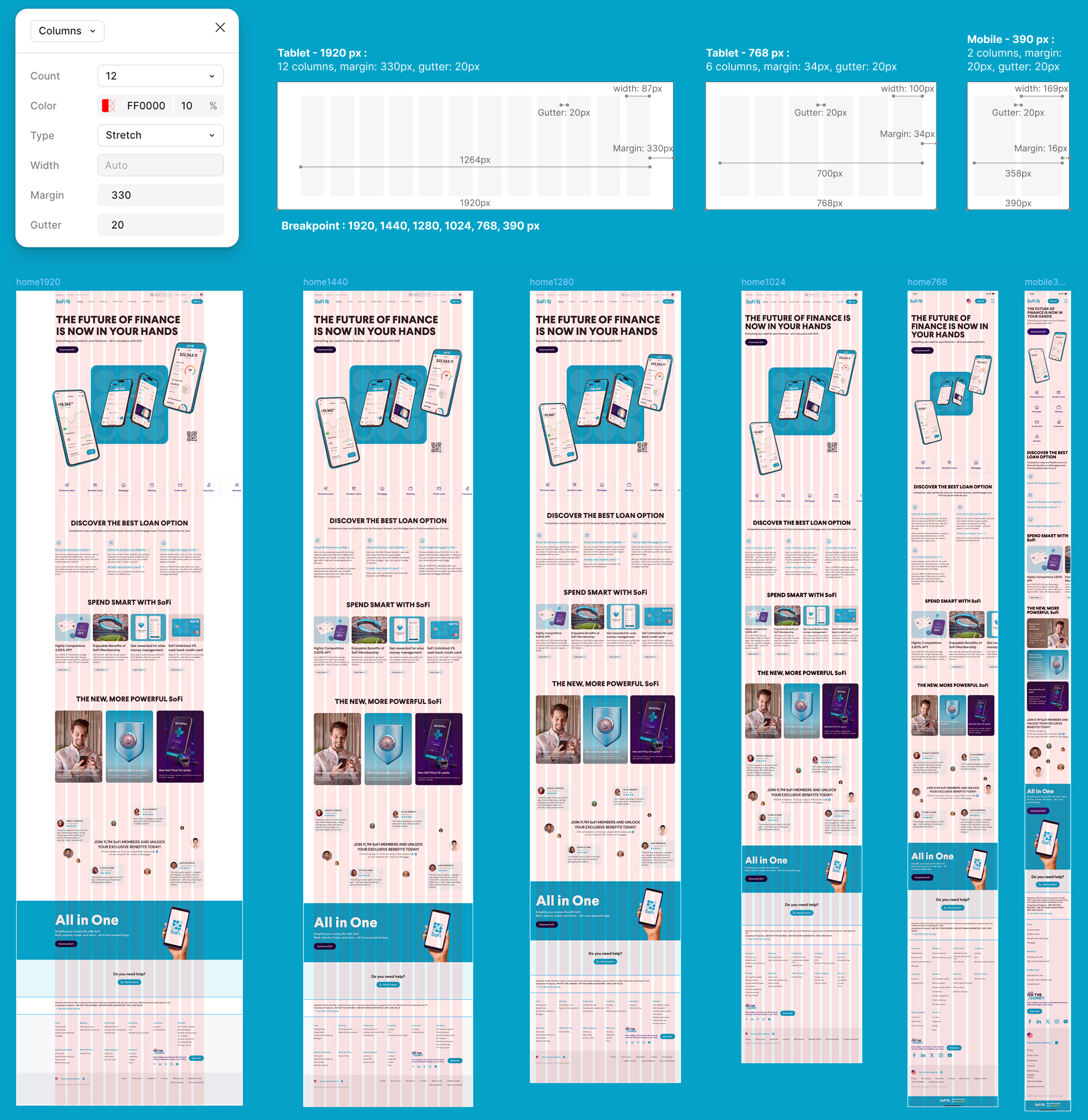
Multi-Device Responsive Grid System
Defining Responsive Grid Layouts Across Breakpoints
To ensure consistent performance across devices, I established flexible responsive layout and typography rules across key breakpoints and documented them within the design system for seamless cross-device adaptation.
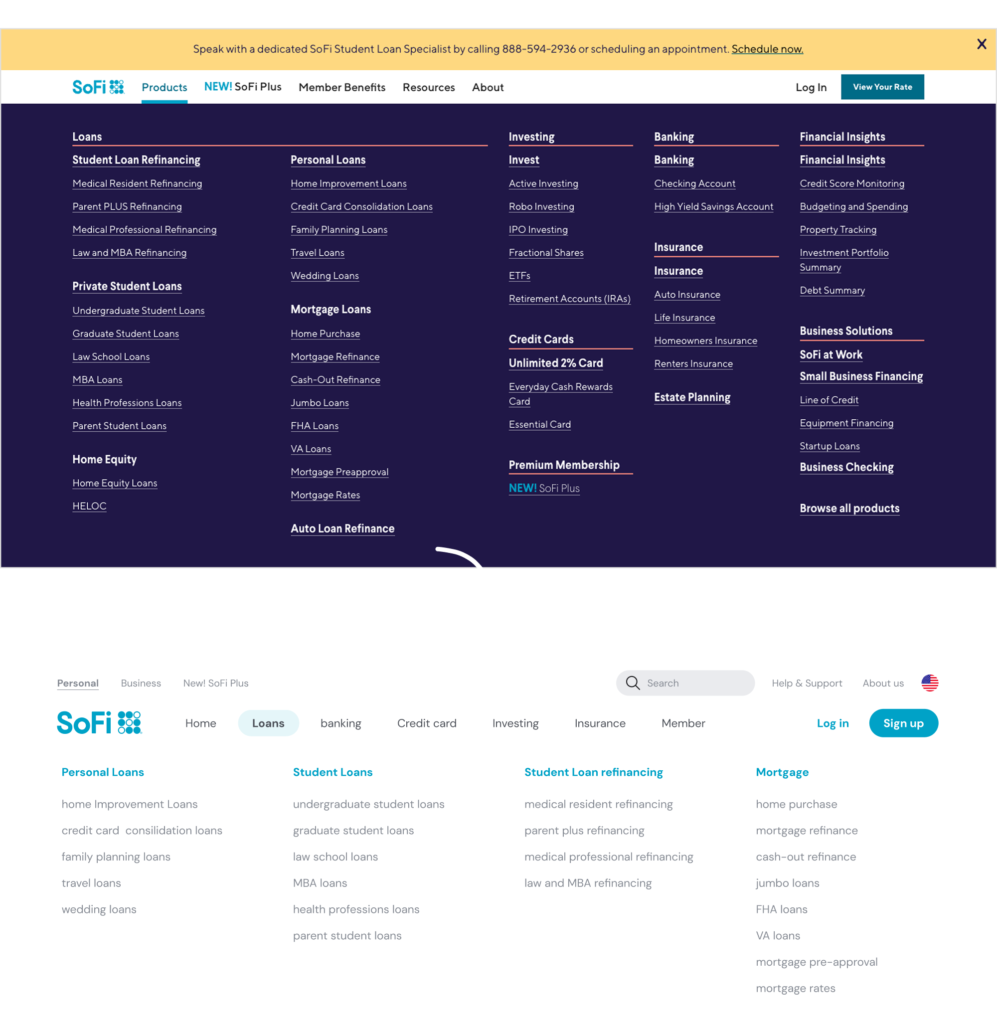
Global Navigation Bar restructuring
From scattered to streamlined, redefining SoFi’s navigation
To improve navigation clarity as a mobile-first banking platform, I analyzed existing subpages and services to restructure SoFi’s GNB, reorganizing top-level tabs and loan categories to create a more intuitive menu.
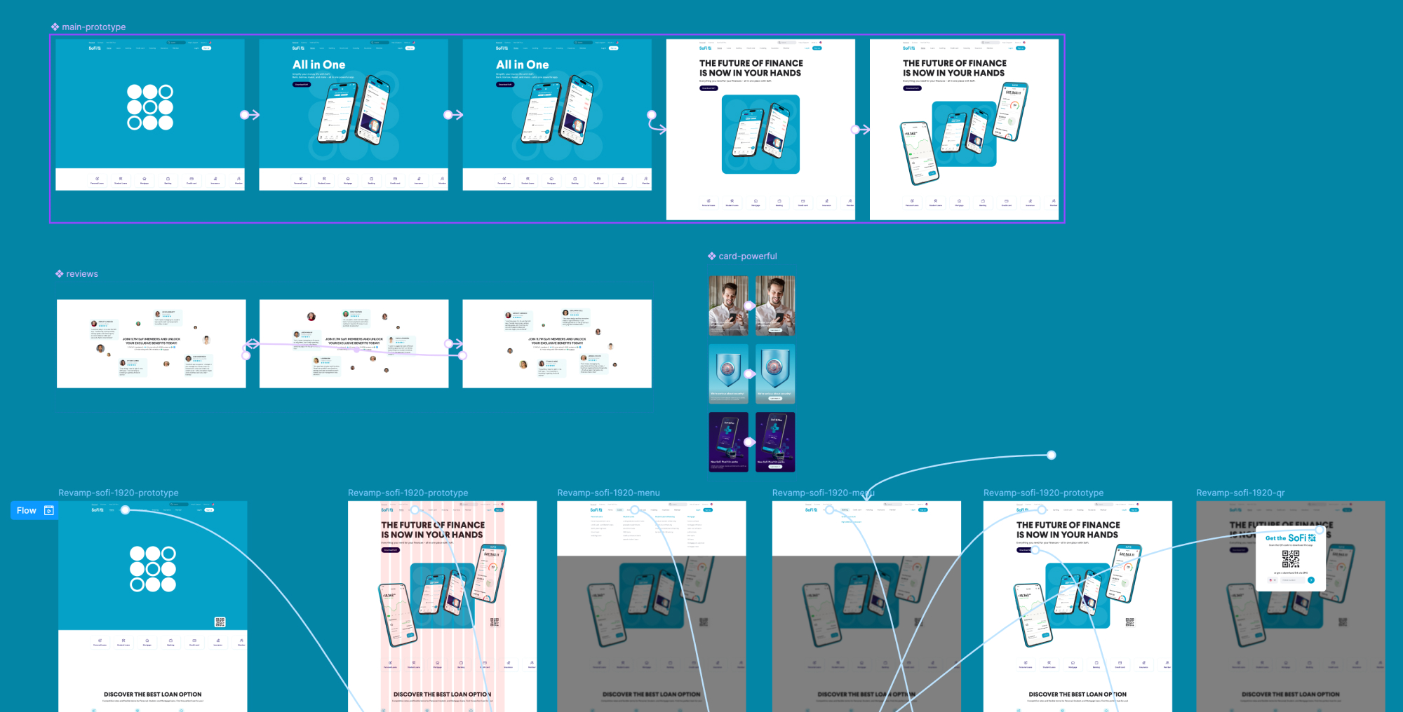
Final Prototype
Driving Action Through Stronger Brand Trust on SoFi’s Homepage
01
First Impression: From Confusion to Clarity
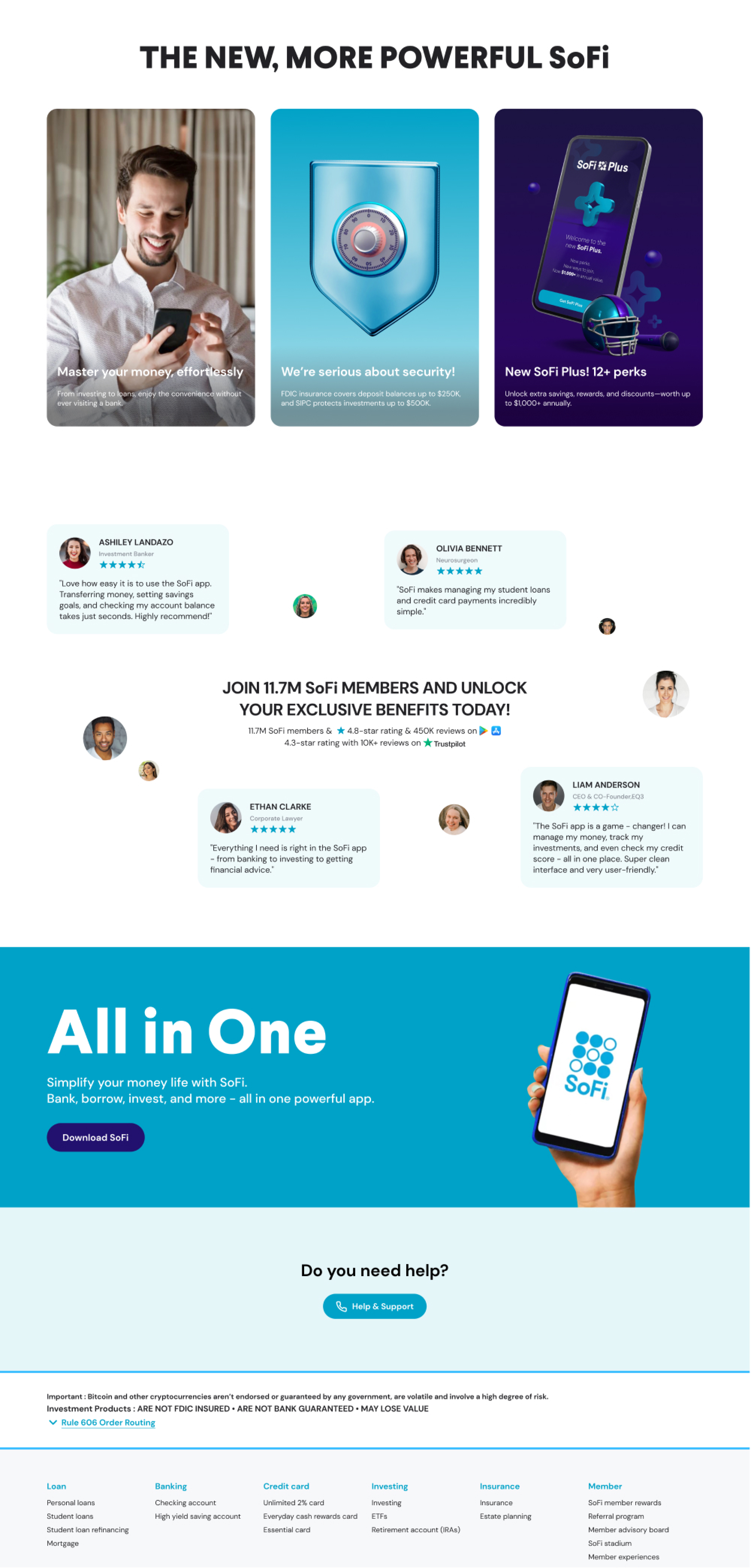
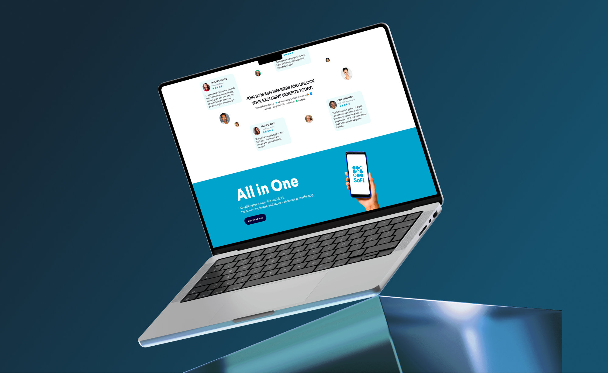
We streamlined the cluttered top navigation and redesigned CTAs to deliver clear outcomes based on user state. The hero section was simplified with interaction to communicate SoFi’s all-in-one financial value clearly and impactfully.
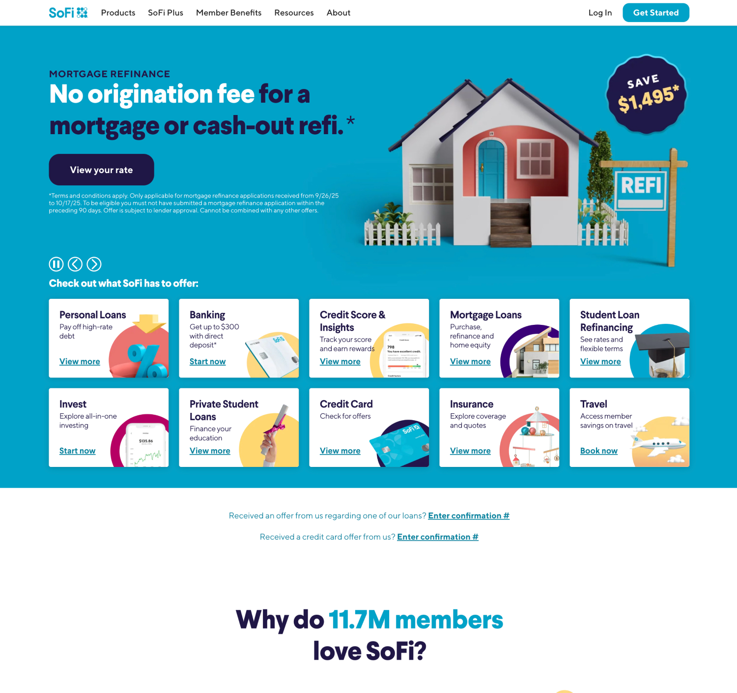
AS-IS hero section
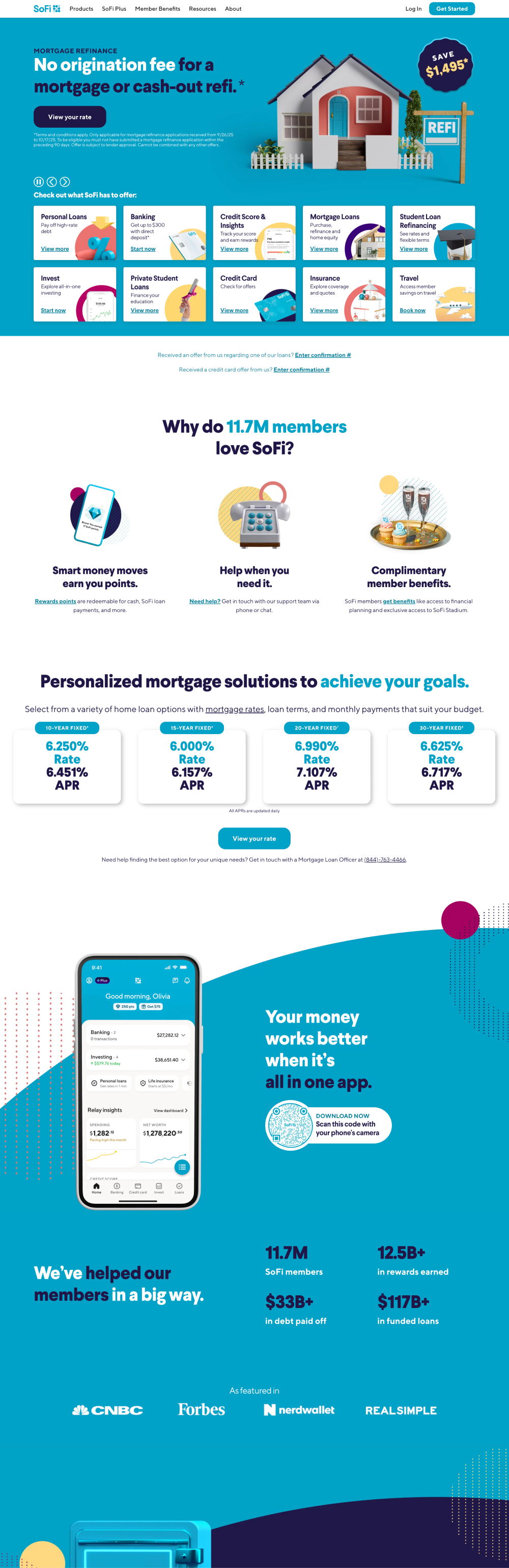
TO-BE hero section
02
Loan Services & Member Benefits
The loan section was reorganized with clear tabs and actions to support exploration of all loan types, while the benefits section adopted real-life visuals to strengthen trust and perceived value.
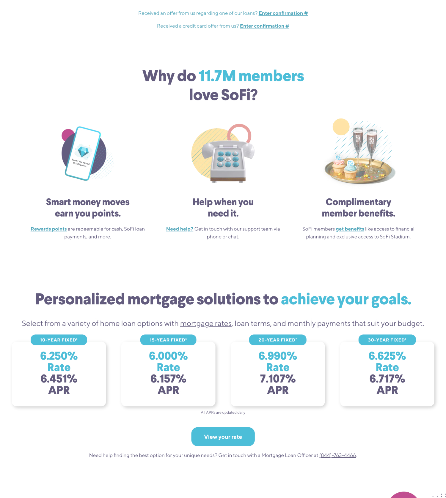
AS-IS loan & service section
TO-BE loan & service section
03
Designing Trust Through Interaction
The visually unappealing security section was redesigned as a hoverable card layout alongside key services, shifting from static logos to interactive UX and user reviews to enhance trust and visibility for the app.
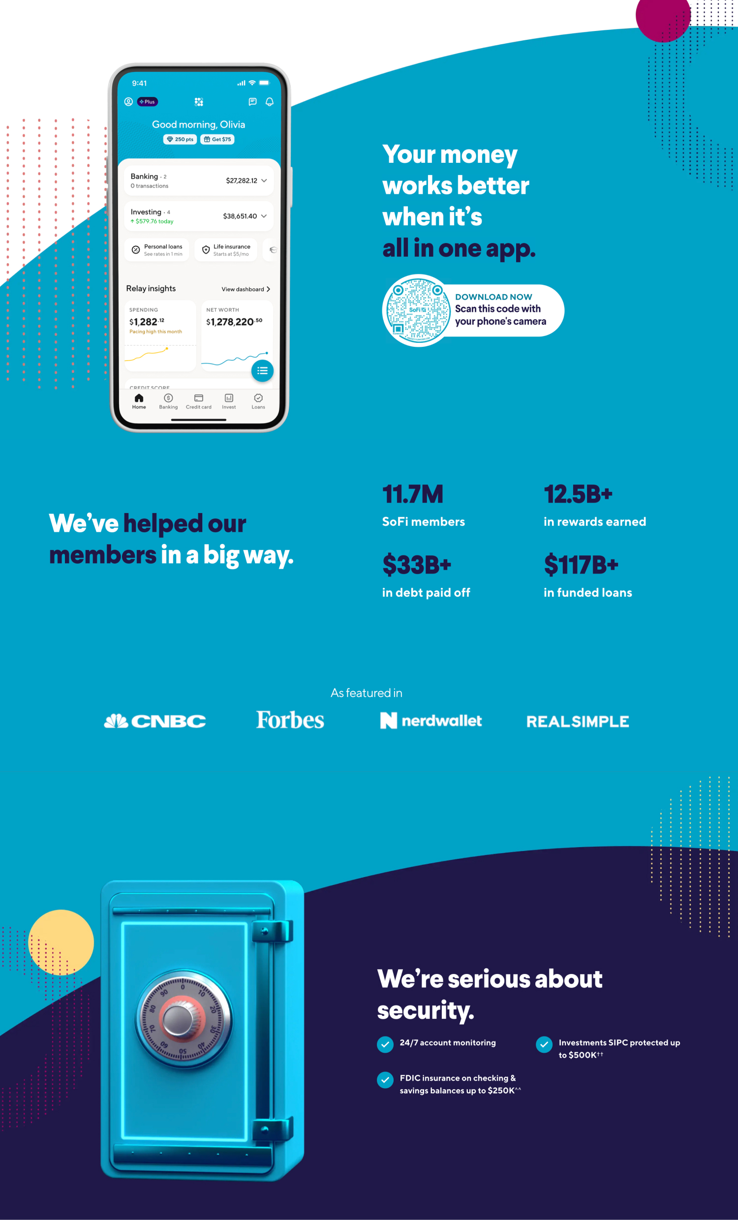
AS-IS security & enhance trust section
TO-BE security & enhance trust section
04
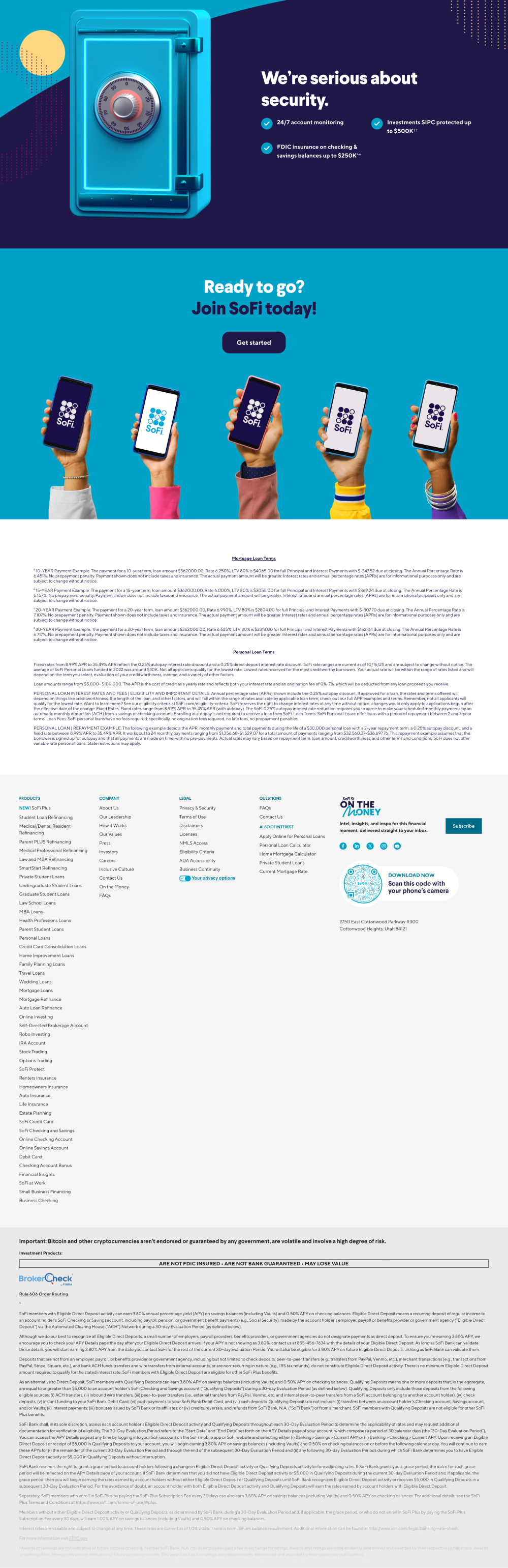
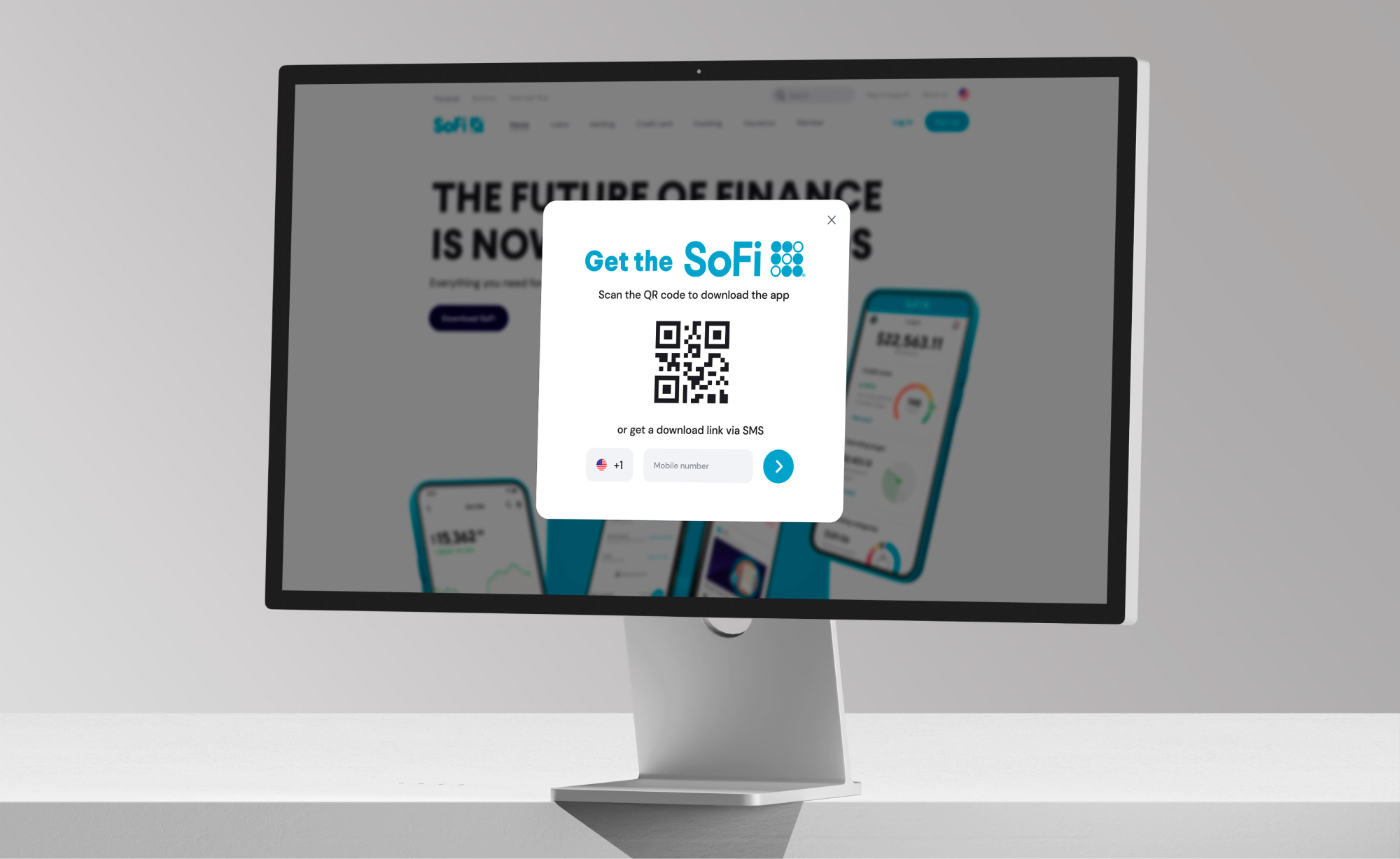
Footer: From Cluttered to Clear
We simplified the footer to reduce visual clutter, improved access to support and app downloads, and moved long loan details to the loan tab while streamlining Rule 606 content into clearer structures.
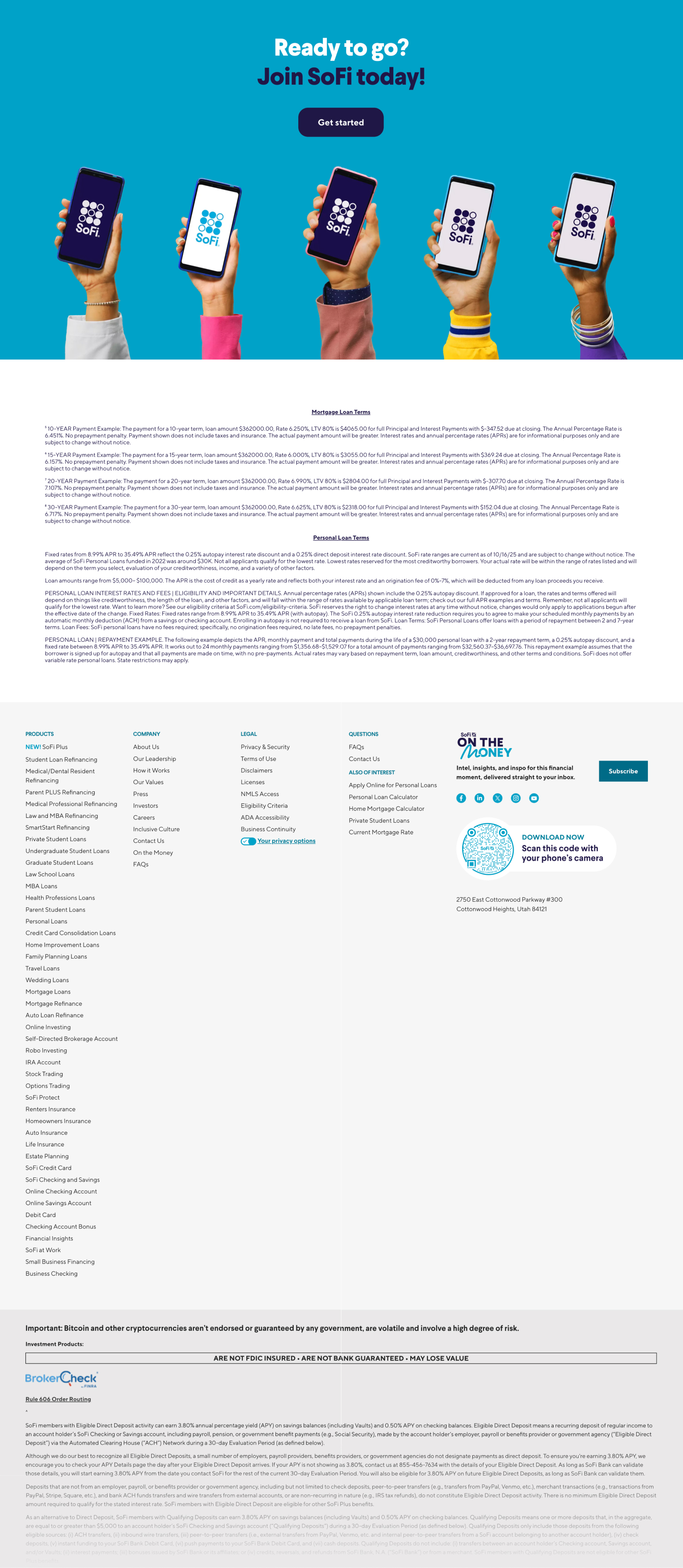
AS-IS footer section
TO-BE footer section
05
Seamless Experience Across Devices
The experience was designed to be consistently responsive across all devices, while reducing distractions such as a permanent cookie prompt (floating at bottom-left) and placing in the footer section to better focus on driving SoFi app adoption.
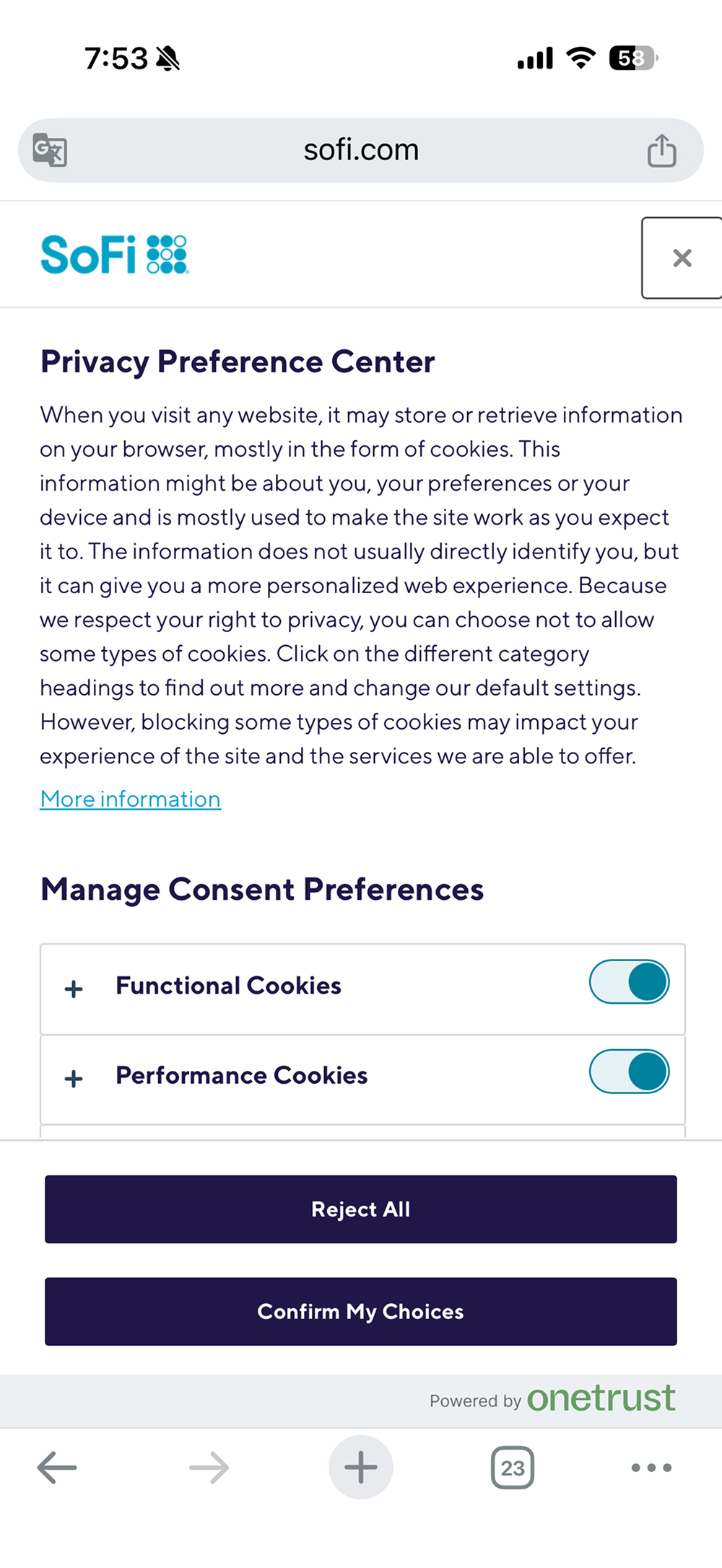
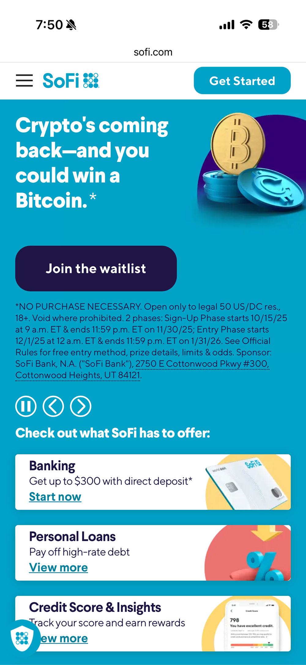
AS-IS mobile web (left: cookie prompt view / right: hero + cookie CTA)
TO-BE mobile web
Reflection
Trust Is Built Through Consistency
This project reinforced that brand trust comes from consistency. Systemizing visual and interaction patterns helped create a more reliable and recognizable SoFi experience.
Clarity Drives Confident Decisions
Clear structure and focused interactions proved more effective than adding information, enabling users to understand and decide with greater confidence.
Let’s work together

Let’s create something amazing together!

Let’s work together
Let’s create something amazing together!
Let’s work together
Let’s create something amazing together!
Let’s work together
Let’s create something amazing together!
I’m currently open to full-time opportunities!
Want to get in touch? I’d love to connect with you!
Copyright © 2026 Jenna Park