Enhancing transactional transparency and trust through clearer transfer flows and AI-supported guidance
My Role
Research
Interviews
Wireframe
Design System
Prototype
Usability Test
Team
2 Product Designers
Tools
Figjam & Figma
Gemini 2.5
Chat GPT 5
Google Sheets
Procreate
Duration
Jun - July 2025
(7 Weeks)
Overview
AS-IS
Problem

Home (US version)
Complex navigation
Lack of Multi-Currency Balance Visibility
Review (transfer flow)
lack of double confirmation
No visibility of the recipient’s final received amount
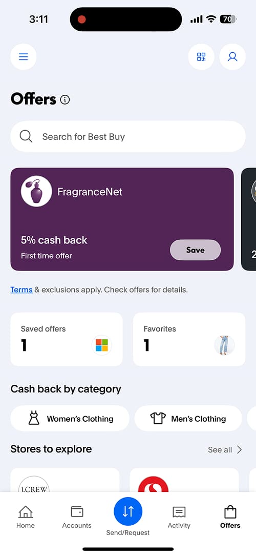
Offer (US Version)
Hard to find desired cashback-eligible items
Unpersonalized listings
How might we make remittances simpler and more transparent while improving navigation and trust?
TO-BE
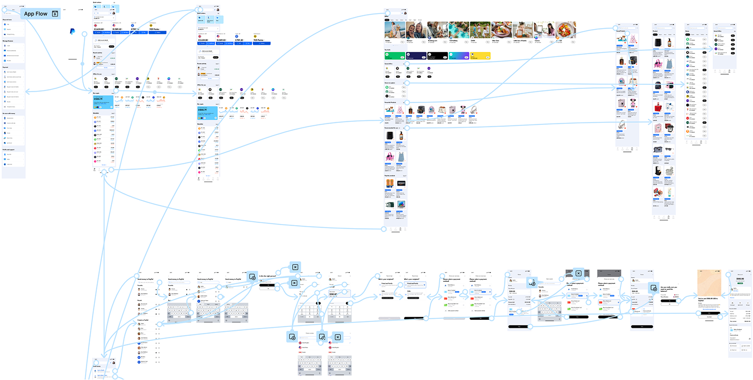
Solution
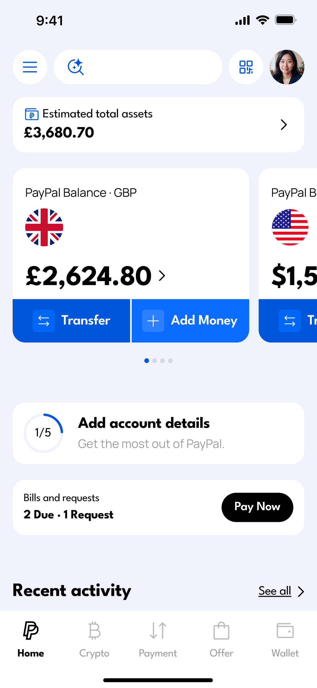
Home
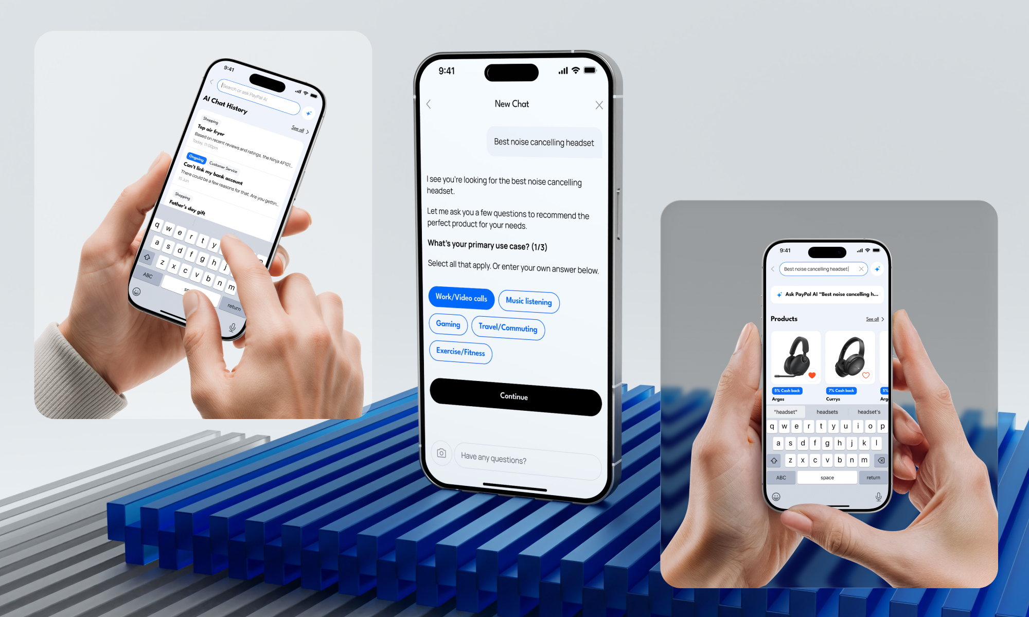
AI Chatbot Search
Added to the global menu to simplify navigation, improve accessibility, and clearly display multiple currencies.
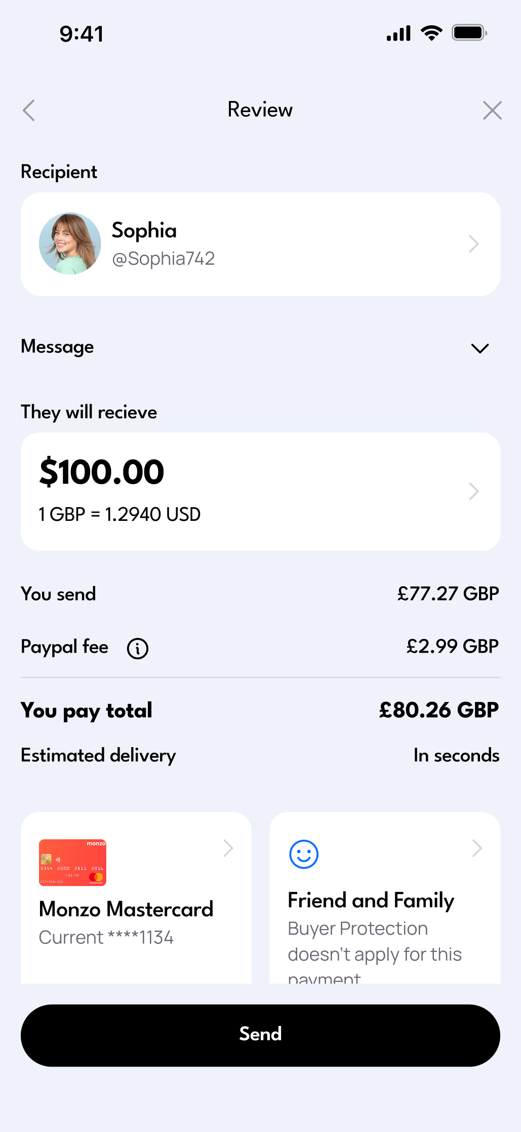
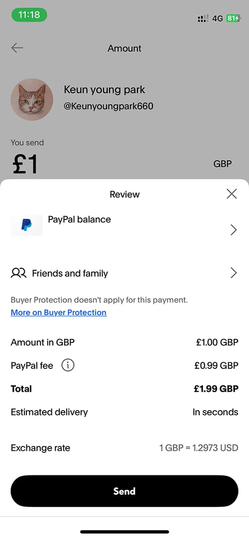
Review (transfer flow)
Clear Transfer Verification
Clear information verification by displaying sent and received amounts, with a double confirmation step to reduce transfer errors.
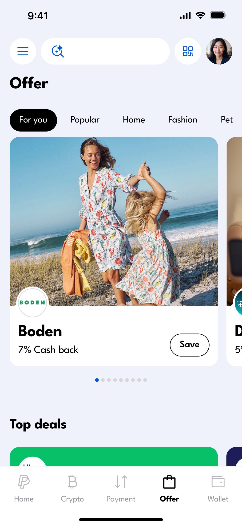
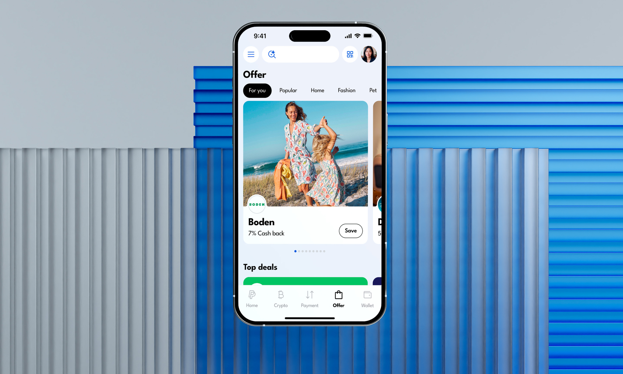
Offer
Clear Personalized Offers
Refined offer visuals to clearly highlight personalized benefits, while keeping the home screen focused on core financial services.
Design Process
Discover
Where Are PayPal Users Losing Trust?
Secondary Research
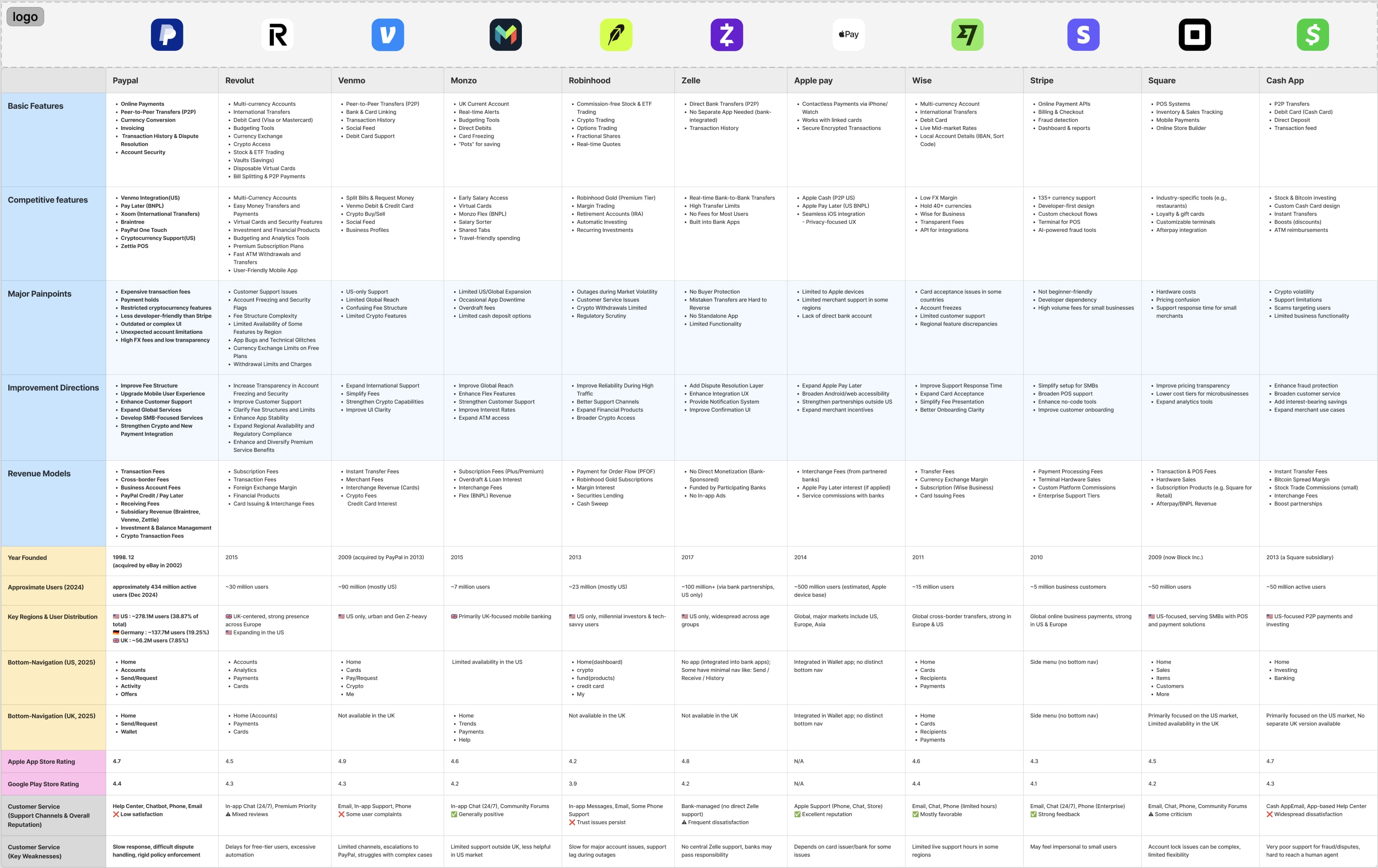
Analyzing the Causes of PayPal’s Decline in Usage
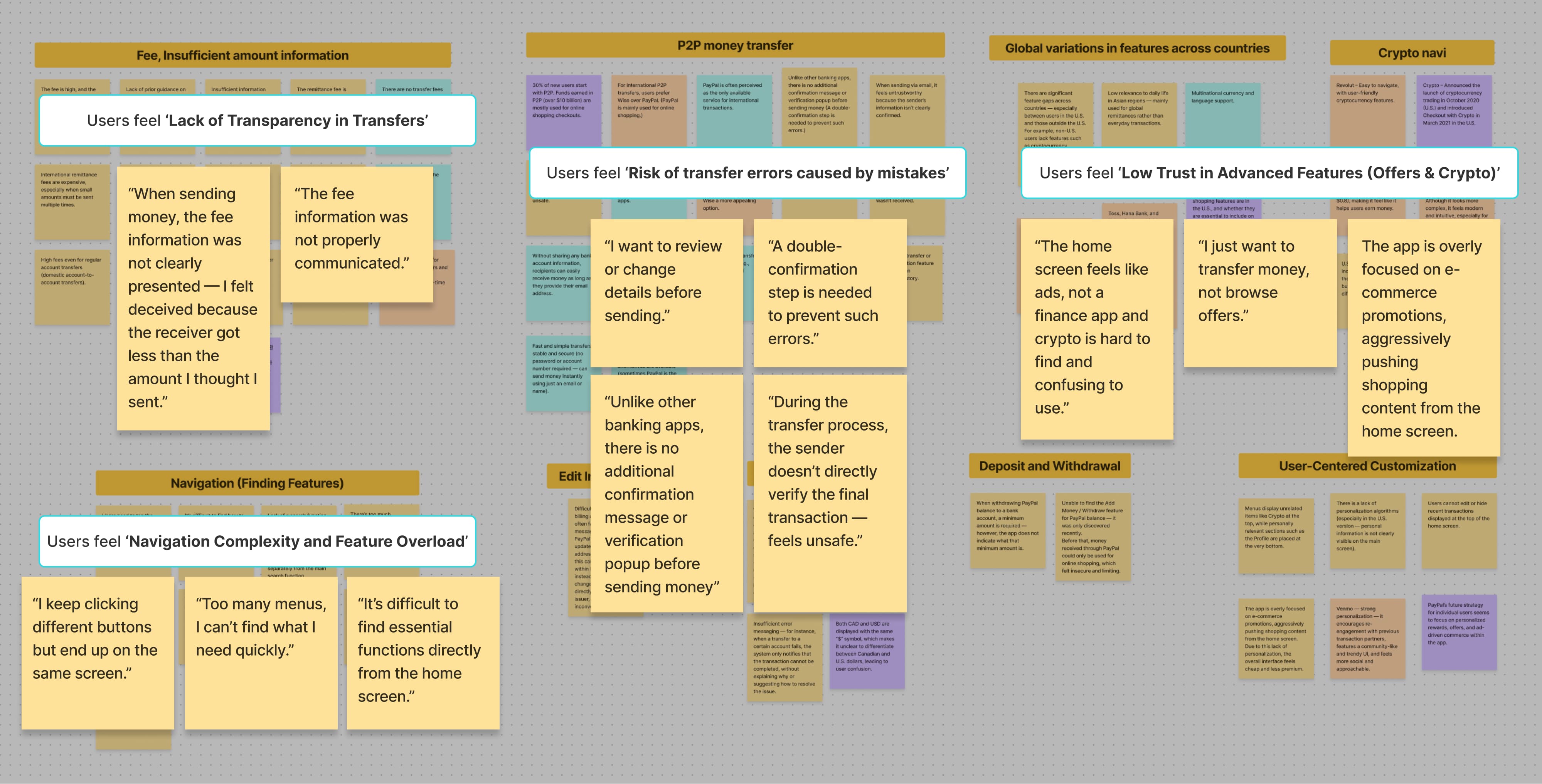
To understand the decline in PayPal usage, we conducted AI-driven market and trend research, competitive analysis, app store review analysis, and a review of PayPal Investor Day 2025 materials. We identified 92 issue cards and organized them into key categories using affinity mapping.
.jpg)

Team affinity mapping session
Key Insights from Secondary Research
Money transfers are a core function with critical friction
PayPal users still heavily rely on it for money transfers, yet experience many pain points in the process.
Underdeveloped features that undermine trust
PayPal is expanding in-app shopping as a super app, but poorly executed features like Offers are eroding user trust.
1:1 IN-Depth User Interviews
Identifying Key Pain Points in Transfers and Advanced Features
Building on the complexity and usability issues identified in secondary research, we conducted 1:1 think-aloud interviews to observe user thinking and navigation during money transfers, and synthesized insights through thematic analysis.
[Participate]
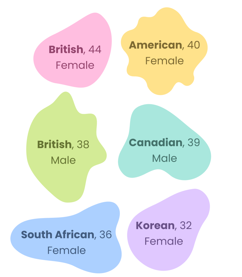
10 PayPal users participated : US (3), UK (2), Singapore (2), South Korea (2), Canada (1)

Key Insights from 1:1 In-Depth User Interviews
Unclear Fees and Final Received Amount
Senders can’t clearly see the final amount received, and missing fee details & confirmation steps create anxiety.
Confusing Navigation to International Transfers
Navigation to international transfers is duplicated across multiple menus, making the feature hard to find and navigate.
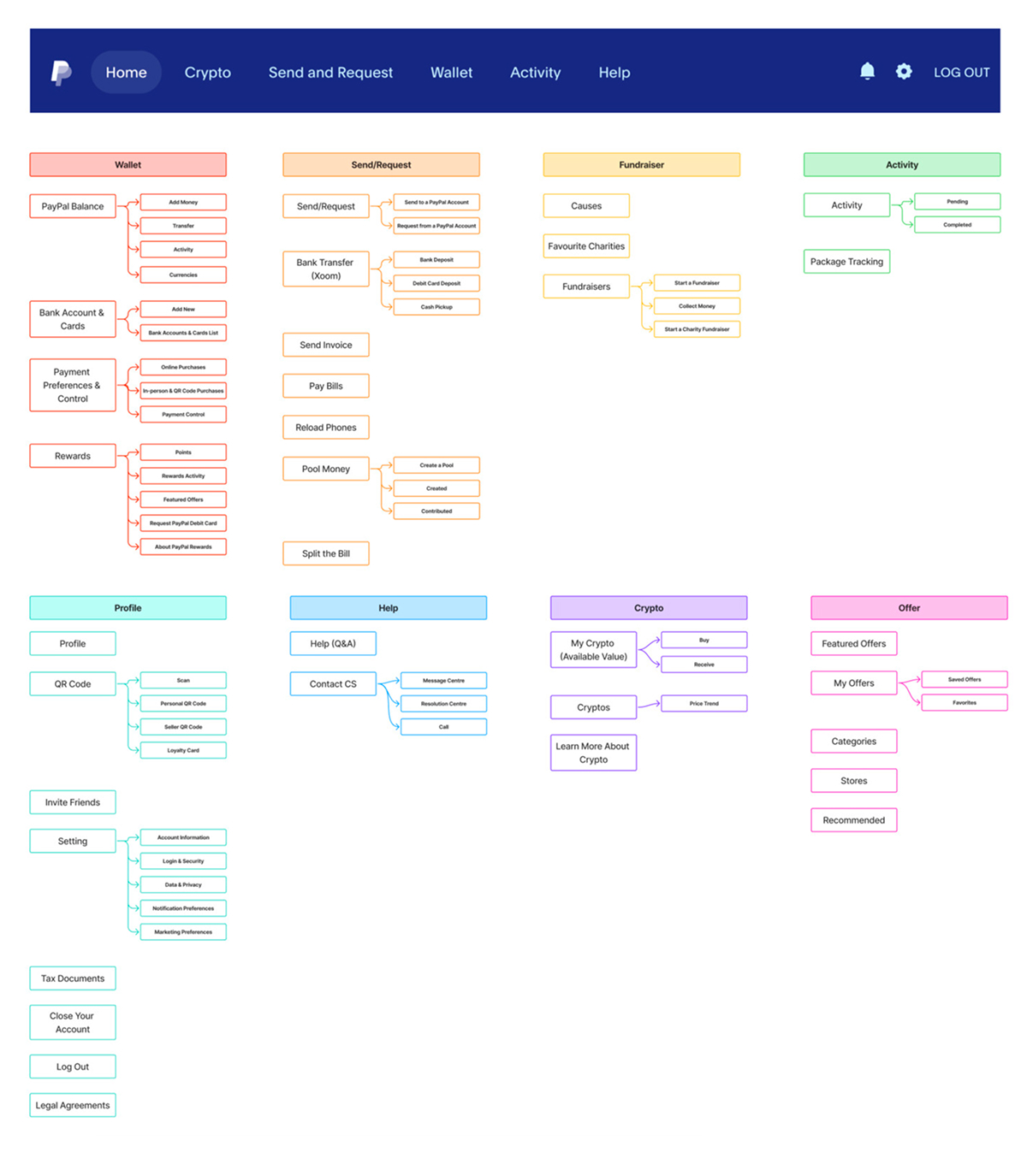
Information Architecture
Analyzing Issues in PayPal’s Current Menu Structure
To address navigation issues from interviews, where multiple international transfer menus led to the same screen, we analyzed the IA of the U.S. and U.K. PayPal apps and the global web, and consolidated redundant transfer menus.

Define
Defining the Core Problems in PayPal’s Navigation and Transfer Experience
User Persona
Defining the Target User to Address Core Issues
We synthesized research insights into a persona, Amy Park, representing core needs around improving PayPal’s international transfers and navigation.

“One small mistake in international transfers can create major problems. I want a payment method that’s safe, clear, and modern!”
Name : Amy Park
Bio : 42, Korean-American living in the UK
Occupation : Global company freelance marketer
Family : husband, 8 year old daughter, pet dog
Amy Park manages multiple currencies through PayPal but often encounters issues like duplicate transfers, unclear amounts, and low visibility on mobile. She wants a simpler and more predictable global payment flow.
GOALS
· Wants reliable multi-currency income management.
· Wants safe, error-free international payments.
· Wants fast access to payment and transfer history.
FRUSTRATIONS
· Hard to manage multiple currencies in the app.
· Weak confirmation steps lead to duplicate or incorrect transfers.
· Unclear fees cause unexpected received amounts.
Problem statement · HMW
Reframing the Problem into a Design Question
PayPal users struggle to confidently manage remittances due to unclear fees and recipient information, along with unintuitive navigation, leading to anxiety and reduced trust.
How might we make remittances simpler and more transparent while improving navigation and trust?
Prioritizing Key Opportunities
Prioritizing Key Issues with a Desirability–Feasibility Matrix
Since we couldn’t address everything at once, we used an Effort–Impact matrix to prioritize high-impact improvements and focus on three key priorities.

Do Now_01
Strengthening the reliability of global remittance flows
Upfront display of received amount including fees (exchange & transaction fees)
Transparent display of fees, rates, and final amount in transaction history
Double confirmation before sending money
Do Now_02
Simplifying and personalizing home screen navigation
Unified financial overview with search, filtering, and multi-currency management
Personalized home screen experience
Do Now_03
Redesigning the Offer structure as a core driver
Personalized Offer screen experience
(Currently, non-personalized offers are scattered across the home)
(Currently, non-personalized offers are scattered across the home)
Quick access to Offers and Crypto from the home screen
3 Key priorities for immediate improvement
Develop
Developing Clearer Information for Home and Transfer Flows
Task Flow
Visualizing Flows to Improve PayPal and International Bank Transfers
To create a more intuitive and reliable remittance flow, we identified key pain points in domestic and international transfers by visualizing two main flows: PayPal-to-PayPal and global bank transfers.
Sketch
Sketches to reduce information overload and clarify the remittance flow.
Sketching the home and transfer flows revealed information overload from showing balances, country labels, crypto, and rewards together. Using Crazy 8s, I explored alternatives and redesigned the top area as swipeable balance cards.
Crazy 8's
Rapid Idea Generation Using Crazy 8s to Optimize Information Hierarchy
When ideas stalled, we used Crazy 8s to generate alternatives, defined essential information for the transfer review screen, prioritized its hierarchy, and refined the concept through sticker voting and team feedback.
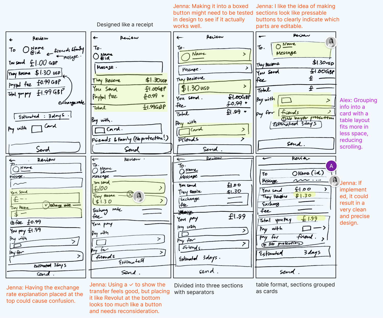
Wireframe
Wireframing the Transfer Flow for Fee & Receiving Clarity
In the existing flow, users often missed the receiving method. Through wireframes, we redesigned the flow to prioritize receiving method selection, surface fees upfront, and replace the bottom sheet with a clear full-screen step-by-step structure.
.jpg)
DeLiver
Validating Flow, Navigation, and Design System Improvements
Design system
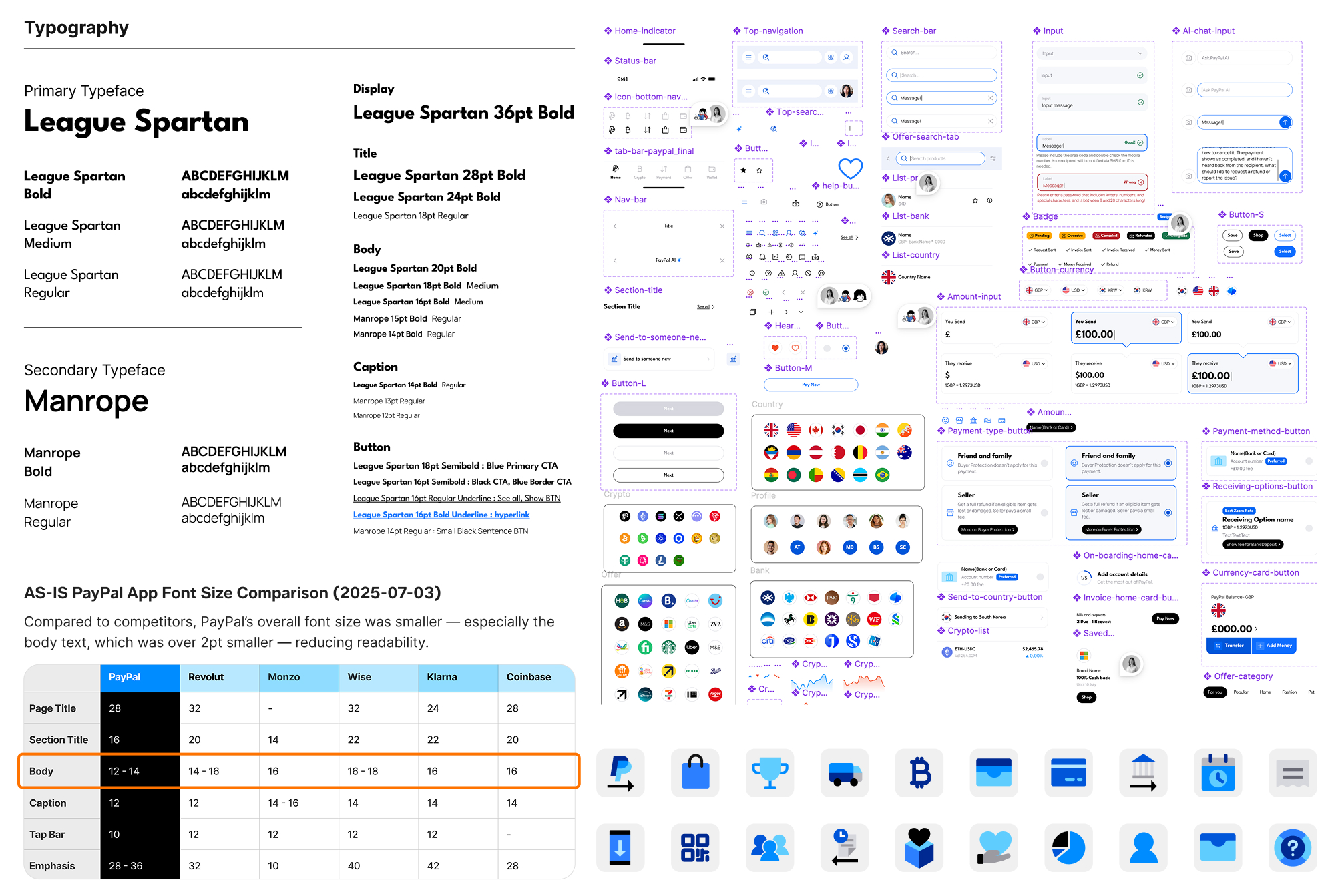
Building a Token-Based Design System
To enhance clarity while keeping PayPal’s identity, I built a token-based design system. Colors were redefined by function, font sizes increased for readability, and components, Auto Layout, Variants, and Variables were used to create a consistent, scalable system.
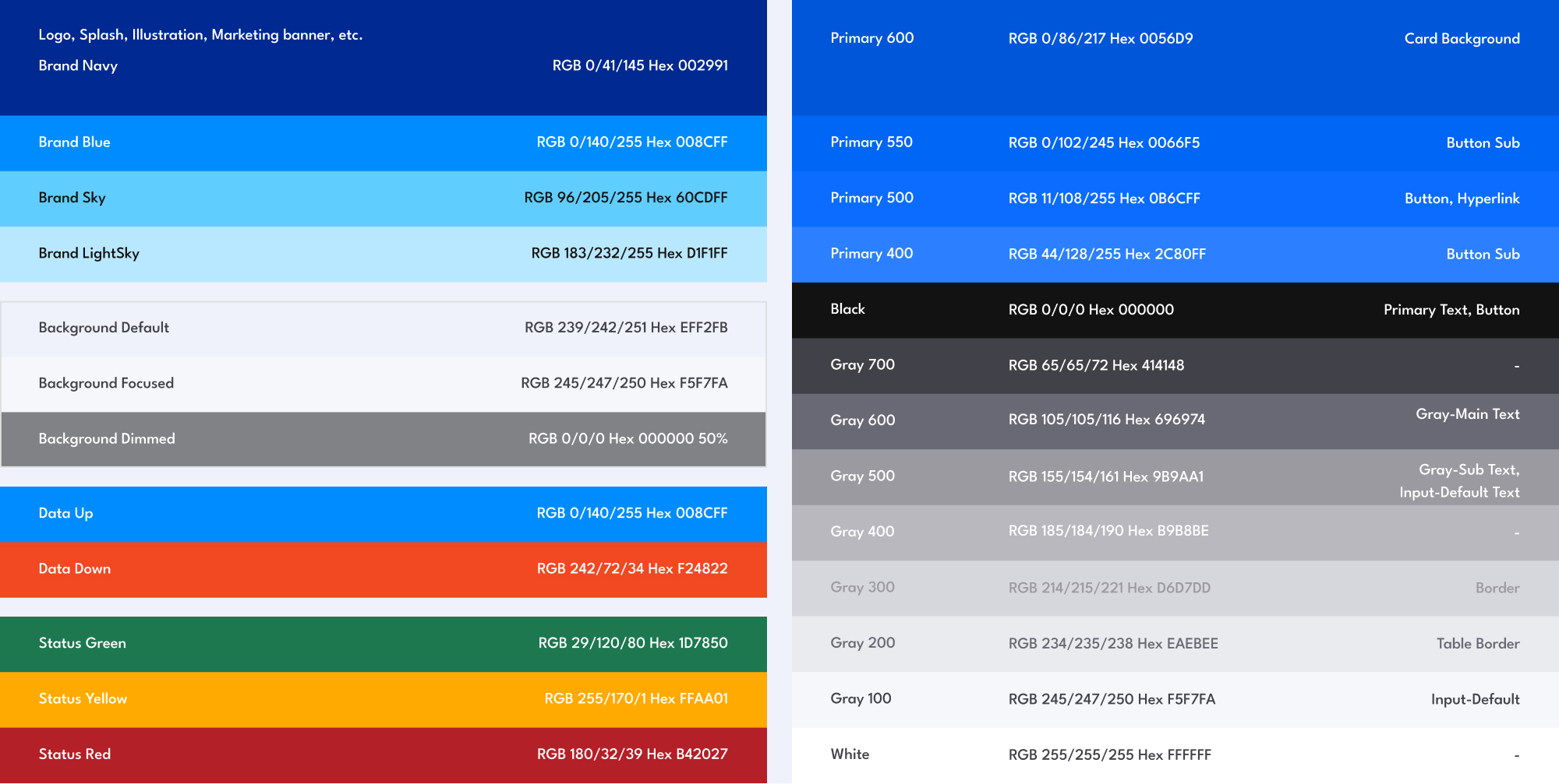
Accessibility (WCAG)
Checking Button Color & Text Contrast for Accessibility
While building design-system components, we resolved contrast issues in the home multi-currency balance card’s buttons by refining the Primary 600/500 hierarchy and adding a 1px white border to meet WCAG standards.
Adjusting contrast ratios to improve accessibility
Prototype
Completing Prototypes for Usability Testing
After refining PayPal’s design system, we built prototypes to test a new transfer flow, AI-driven home navigation, and the Offer page.
Usability test
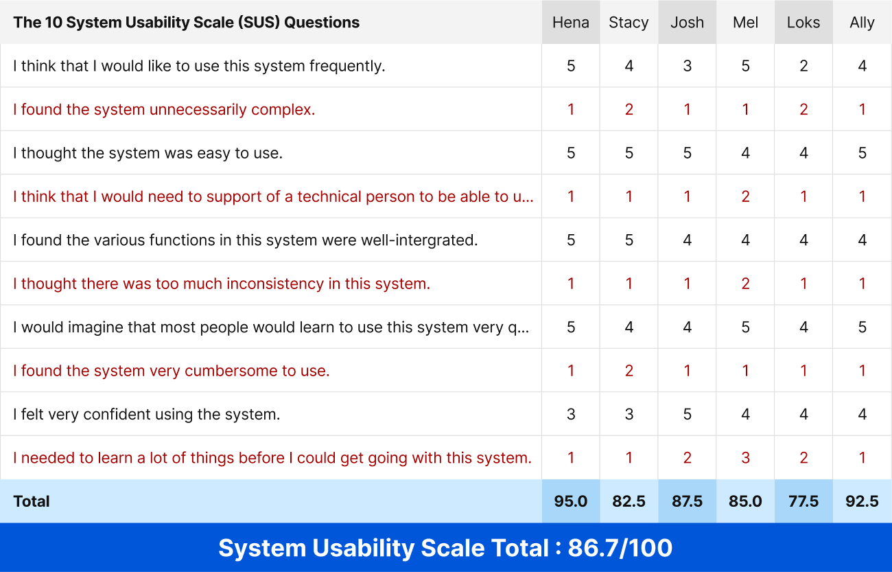
Usability Test and SUS Results Based on 5 Task Scenarios to Validate the Redesign
To validate a clearer and more reliable PayPal transfer flow, we tested 5 task scenarios with six users based on the core persona, Amy Park. The average SUS score was 86.7 (Excellent), while slightly lower LOKS scores revealed minor issues around the AI search entry point and understanding of some transfer steps.
[Participate]
6 PayPal users from around the world
[Session Length]
40 - 60 minutes per participant
[Task]
01
Home
Explore the home, navigate the full menu, and check multi-currency and crypto balances.
02
AI Chat-bot Global Search
Use the AI Chatbot to search for and save the Bose noise-canceling headset.
03
Money Transfer (UK → US PayPal)
Send £77.27($100) from the UK to American friend ‘Sophia’ via PayPal account transfer.
04
Money Transfer (UK → Korean bank)
Sending £100(₩180,641) from the UK to a non-PayPal user’s Toss Bank account in Korea.
05
Offer
Browse Offer items, then save your favorite stores and products.
[Post-Task Questionnaire]
· Does the app give you a sense of being a reliable financial platform?
· Did this screen feel engaging or a bit overwhelming?
· Is it clear how much the recipient will receive?
· What kinds of services did you expect under this menu option?
· Was the AI assistant visible and easy to access?
.jpg)
Iteration
Design Screens Iterated Based on Prioritized Usability Testing Insights
Using usability insights, we prioritized high-impact, low-effort improvements with a 2×2 matrix and iterated on the design, improving transfer trust, navigation speed, and task success. Before-and-after screens are shown below.
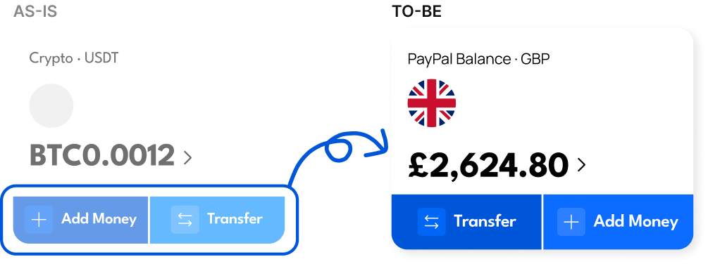
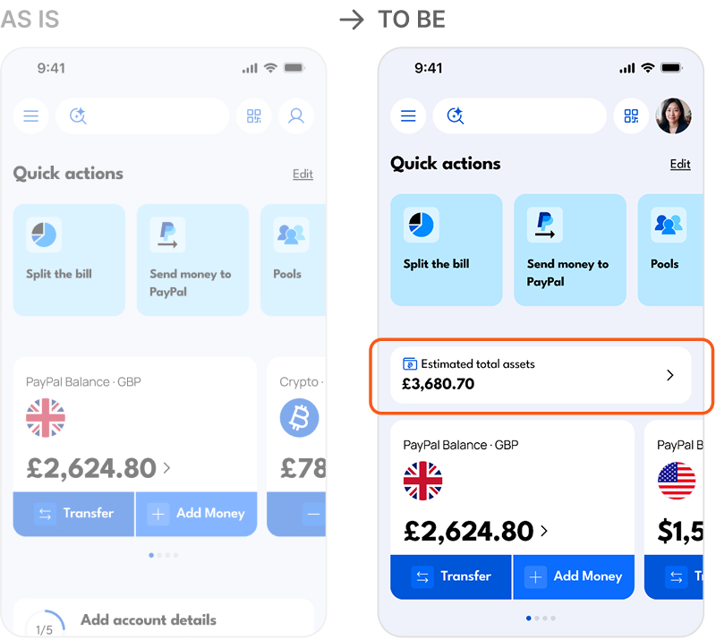
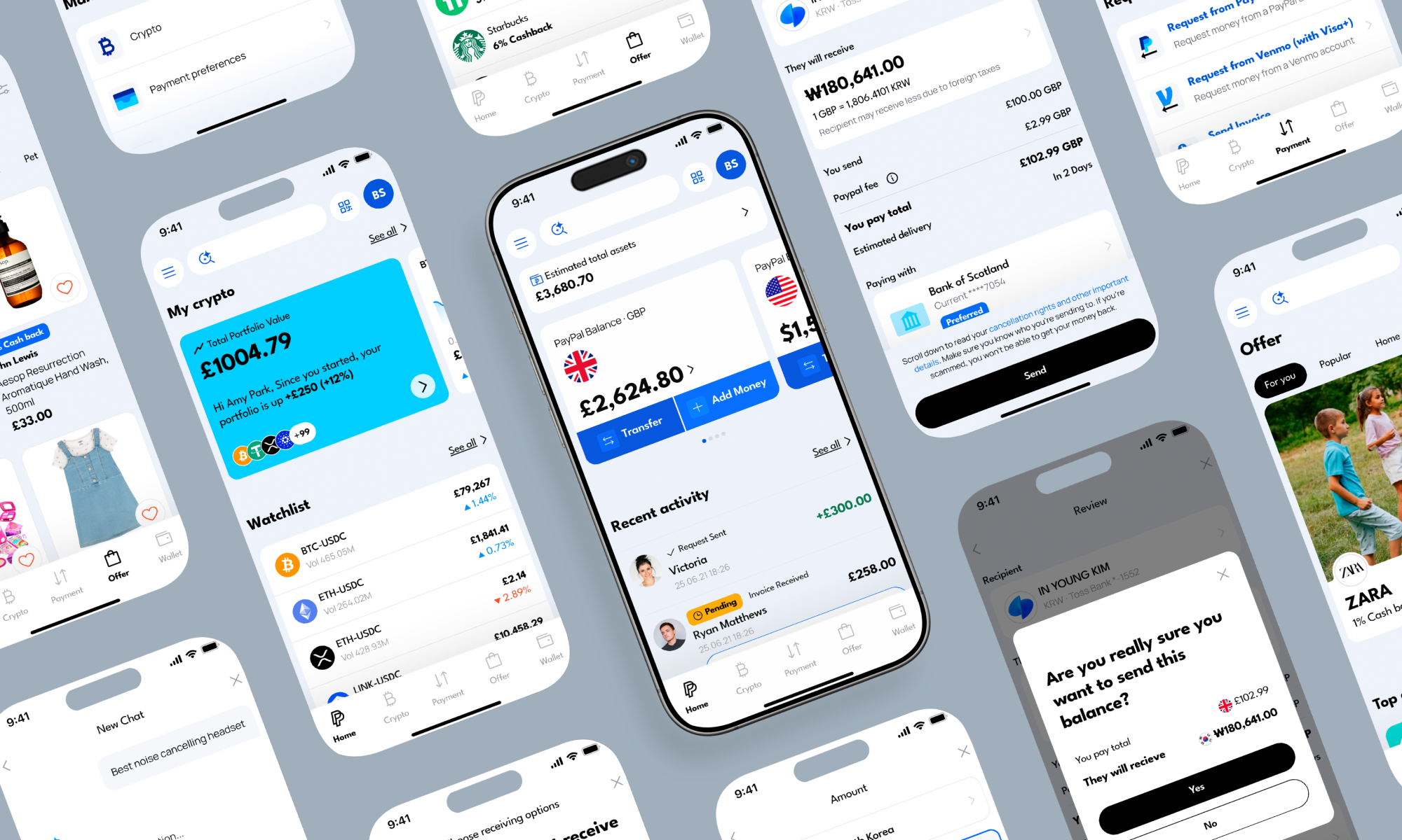
Balance Card
Users wanted an overview of total funds, so we added a compact top balance card to clarify hierarchy and improve space efficiency.
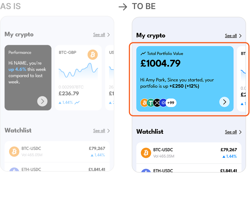
Crypto Portfolio Preview
To provide clearer asset visibility, the crypto card was expanded to show total value and market changes at a glance.
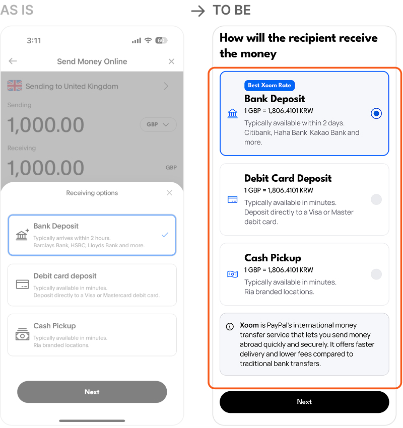
Xoom Transfer Flow
Guidance and clearer copy were added to make the unfamiliar Xoom transfer flow more intuitive for international users.
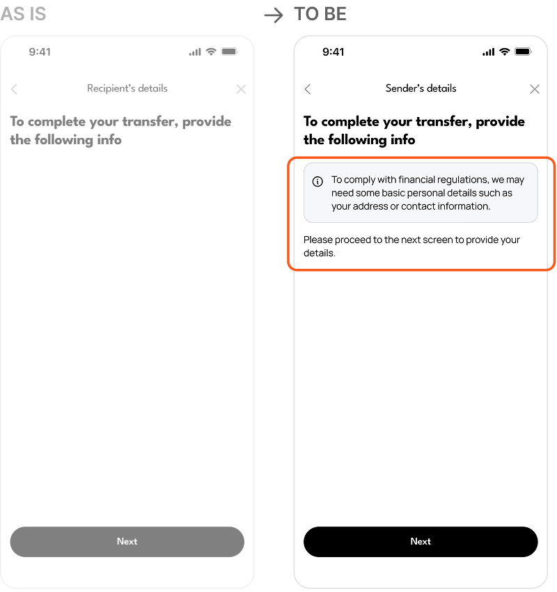
Recipient Information Flow
A brief explanation and review step were added to reduce confusion and help users confirm recipient details.
Screens updated through post-usability-test iteration
Final Prototype
Final Validated Product Improvements Across Home, Transfer, AI Search, and Offer
AS-IS Home
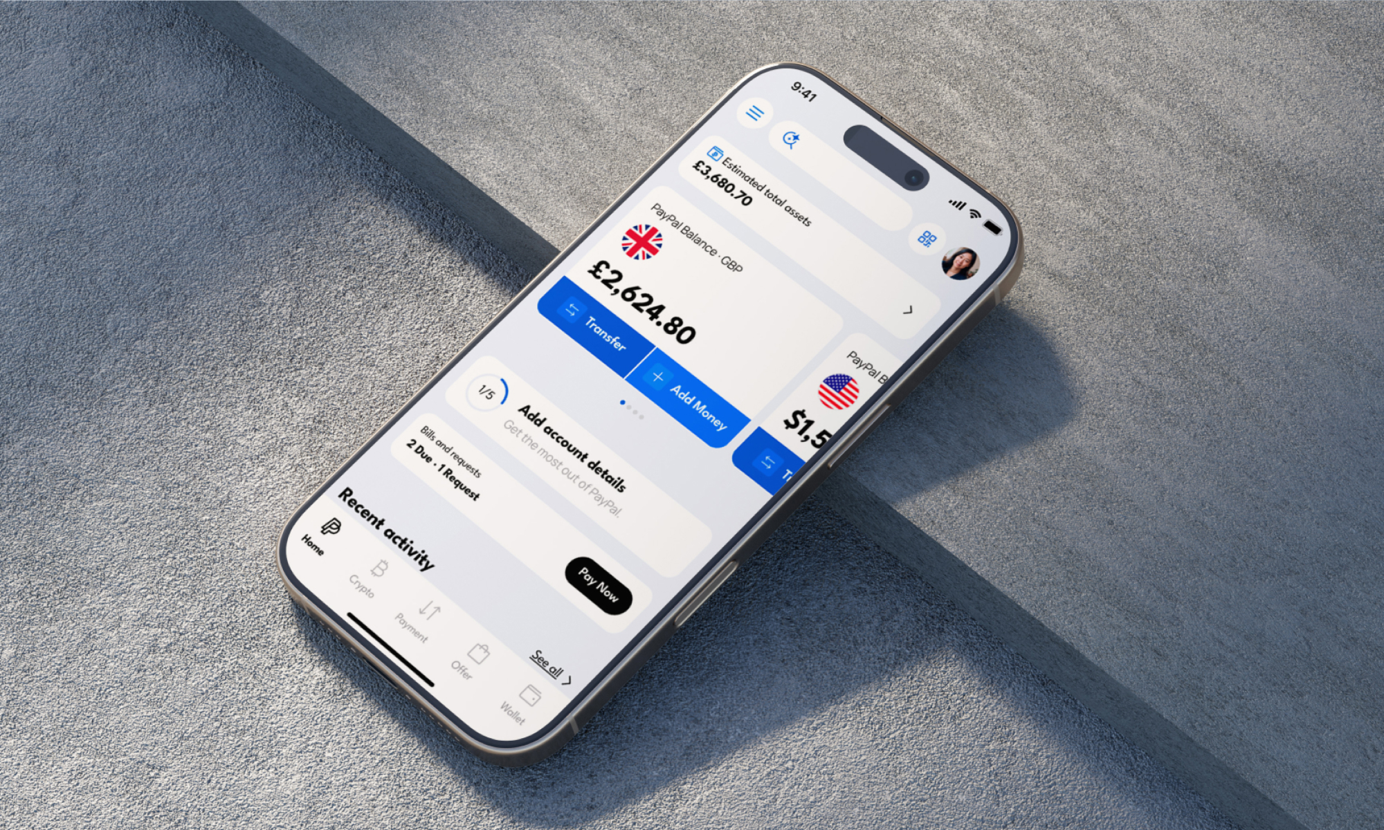
Home
The PayPal UK app update released near the end of our redesign adopted an Offers-focused structure, validating that our design direction aligned with real market trends.
AS-IS Review
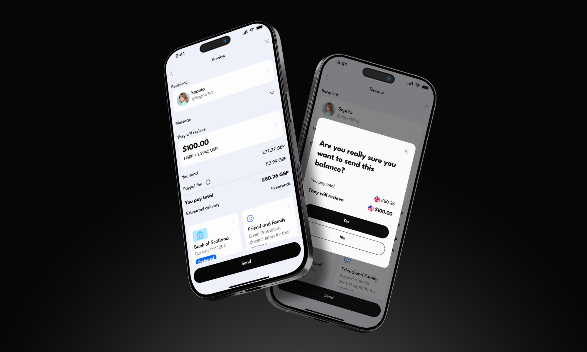
Money Transfer
We improved multi-currency international transfers by adding a transaction review page, double-confirmation popup, and post-transfer details to enhance transparency and security.
AS-IS Assistant
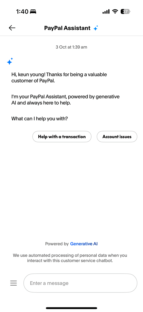
AI Chat-bot
We replaced the four-step Help flow with a global search bar and the PayPal AI Agent, significantly improving accessibility and response speed.
AS-IS Offer
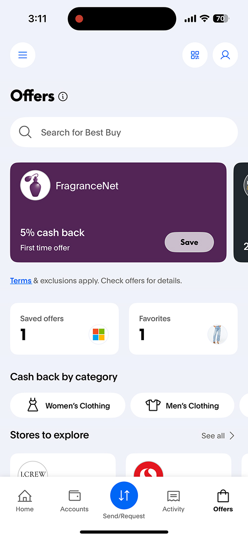
Offer
We reorganized the previously scattered Offer cards with engaging thumbnails, clear hierarchy, and stronger personalization, improving readability and visual focus.
Reflection
User-Centered, Research-Driven Design
The project highlighted that grounding design decisions in real user behavior and research results in deeper insights and more meaningful outcomes, reinforcing a user-first approach.
Balancing Vision and Feasibility
Through collaboration, I focused on how to balance ideal UX with technical constraints, translating creative ideas into practical and feasible designs that can realistically be built and scaled.
Let’s work together

Let’s create something amazing together!

Let’s work together
Let’s create something amazing together!
Let’s work together
Let’s create something amazing together!
Let’s work together
Let’s create something amazing together!
I’m currently open to full-time opportunities!
Want to get in touch? I’d love to connect with you!
Copyright © 2026 Jenna Park